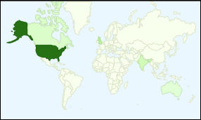
On the Google Analytics dashboard there’s a world map, that shows where my Excel blog readers are located. Not surprisingly, most are in the USA, and the rest are concentrated in a swath of English-speaking countries, from Canada to New Zealand.

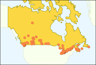
The map never changes, so I usually glance at it and move on. Today though, I clicked on Canada and it showed a dot for each city with readers. Hello, Yellowknife! And apparently they don’t have the Internet anywhere Sault Ste. Marie and Winnipeg, or maybe they have the Internet, but no Excel users.
Coincidentally, the second city in from the right is Sydney, Nova Scotia, and the second city from the left is Sidney, British Columbia.

The line of dots along the border reminded me of a comment that David Letterman made last week, after the Olympics. He said the USA wouldn’t have to invade Canada to overtake it, they could just move the border 1° north.
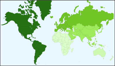
If you zoom out from the map, you get a regional analysis of the visitors. No surprises there, with most readers from the Americas.

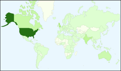
And finally, I checked a larger version of the dashboard map, that gives better detail on the world countries. The only surprise here is that no one from Greenland has visited the Contextures Blog in the past month. I’ll have to get the marketing team to look into that.

So, are there any surprises in your Google Analytics maps?
______________
